
Types of charts
Information is not investment advice
There are 3 main types of charts in MetaTrader. You can switch between them by clicking icons on the “Charts” toolbar.
Let’s see how these chart types differ.
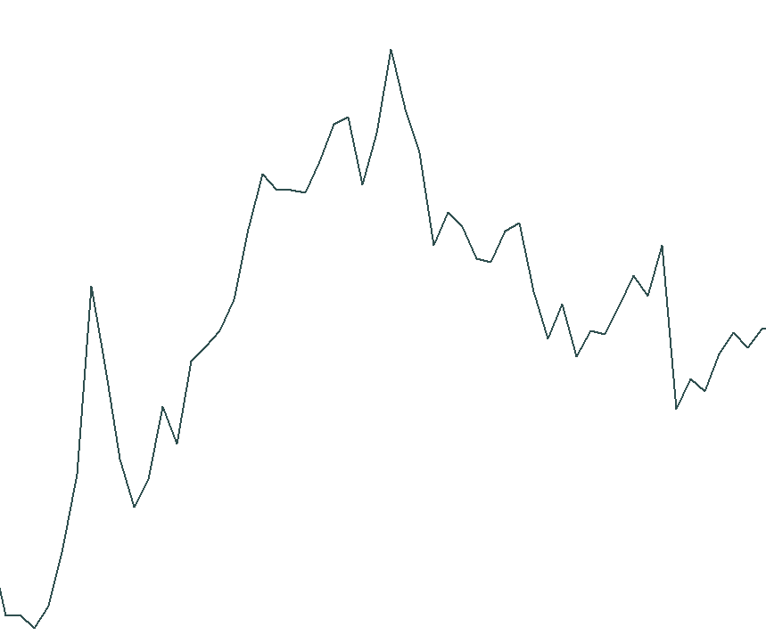
Line chart
This is the simplest of all chart types. It is constructed by joining together the closing price of each period, for example, daily closings for the daily line chart or weekly closings for the weekly chart.
The fact that a line chart uses only closing prices means that it eliminates some of the market noise (i.e. unimportant moves of the price) and allows a trader to focus on the key changes in price. This type of chart might easier to comprehend for beginner traders. The line chart allows traders to identify the important support and resistance levels, trends and certain chart patterns.
On the downside, a trader may want to have more information about the prices than a line chart can provide. Sometimes it’s necessary to know not only the closing price but also the open, high and low price level. Another drawback of a line chart is that it doesn’t show gaps. There are other chart types (bars and candlesticks) that will help you with that.
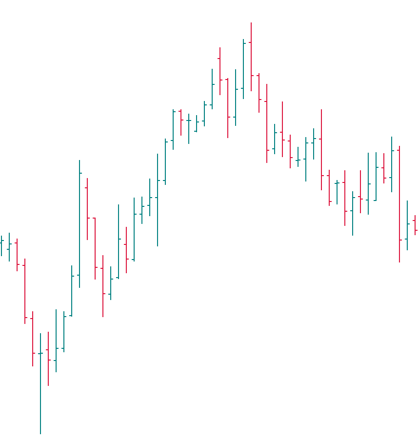
Bar chart
Bar charts show the price range during a certain period of time. A bar is a vertical line that connects the high and the low of a price during a time period. Horizontal lines mark the opening price (left) of that specific trading period and the closing price (right). On the weekly chart, each bar stands for 1 week. On the H1 chart, each bar shows the scope of price action for 1 hour.
Different colors may be used to identify bars that closed at a higher price than they had opened (bullish or up bars) or at a lower price than they had opened (bearish or down bars). At the example below, bullish bars are green and bearish bars are red.
By looking at a bar chart, a trader can quickly form an idea about what happened with the price in particular moments and time periods. This is very convenient for market analysis.
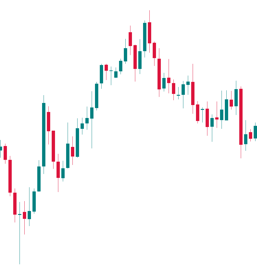
Candlestick chart
Candlestick charts provide traders with the same information as bar charts, but bodies of candlesticks are given dimension and filled with color (usually candlesticks are green/white if the price increased during that period of time or red/black if the price declined). This type of charts originated in Japan. It is said to be invented in the 18th century by a rice trader called Munehisa Homma.
The lines which extend up and down from candlesticks’ bodies are called wicks or shadows. The top of the upper wick indicates the highest price during a time period, while the low of the lower wick shows the minimal price level during a time period. If a candlestick has a wick that is big compared with the size of its body, it’s a sign of a potential reversal point in the market. Experienced traders can get a lot of information about the market's psychology from a candlestick chart.
Most traders agree that candlesticks are visually easier to read than bars, though there still are those who prefer bars to candlesticks.
Which type of chart is the best? The answer to the question is individual for every trader. It also depends on the goals you have in our market analysis. Line chart may be a great tool for quick recognition of trend. At the same time, a candlestick chart looks more visually informative and, in general, it’s the most popular type of chart among currency traders. You will learn more about Japanese candlesticks in the following articles.
Other articles in this section
- Timeframes
- Heiken Ashi
- Quantitative easing policy
- Pivot Points
- ZigZag
- Moving Average
- Williams’ Percent Range (%R)
- Relative Vigor Index (RVI indicator)
- Momentum
- Force index
- Envelopes
- Bulls Power and Bears Power
- Average True Range
- How to trade on central bank decisions?
- CCI (Commodity Channel Index)
- Parabolic SAR
- Stochastic Oscillator
- Relative Strength Index
- Oscillators
- ADX indicator
- Bollinger bands
- Trend indicators
- Introduction to technical indicators
- Support and resistance
- Trend
- Technical analysis
- Central Banks: policy and effects
- Fundamental factors
- Fundamental analysis
- Fundamental vs technical analysis
Choose your payment system