


15 Most Significant Stock Chart Patterns

When you’re trading stocks, using technical analysis can help you spot any shifts within the market. Chart patterns are what you can use as part of your technical analysis. They appear on price charts and indicate the direction in which the market is likely to move and where you can potentially enter or exit a trade.
In this article, we will tell you what chart patterns are exactly, how you can use them in your trading, and find out about the 15 most significant stock chart patterns that will help you with your trades.
What are chart patterns?
Chart patterns are graphical renditions of price fluctuations represented by a series of trend lines and curves on a chart. Of course, not every rise and dip that occurs on the market is a part of some pattern. But if the price moves in a way that has been previously observed before a particular market event, there is a very high chance that this new formation is likely to be followed by the same event.
How do chart patterns work?
Chart patterns became a popular method of predicting the future direction of the trend because the market is considered cyclical in nature. But since stock chart patterns are a part of technical analysis, the justification behind them is based on the notion that the behavior of investors tends to repeat itself over time.
Stock prices don’t move on their own. Rather, they are a reflection of the decisions made by real people who are driven by the same emotions and ambitions as their predecessors. The stock charts serve as the representation of these emotions, whether it is optimism or pessimism. So if the price forms a distinctly familiar pattern, it means that traders might end up making the same trading decisions as others before them.

Why you should analyze the chart patterns
Even though patterns aren’t 100% reliable when it comes to predicting the direction of the price movement, they can be used in various other ways. Charts represent the change of supply and demand within the market, when the traders are more interested to buy a stock than sell it, or vice versa.
When the market moves in a certain pattern, it becomes easier to predict. Support and resistance levels, breakout points, entry stops, potential retracements are among the things that a trader can detect from a single chart pattern. So even if the trend ends up going in a different direction from what you expected, you will have plenty of information to protect your trades from losses.
Types of chart patterns
There is a wide variety of different chart patterns but all of them can be divided into three distinct groups:
- Continuation patterns. Continuation patterns indicate that the current trend is going to continue after the pattern is complete. These patterns generally appear on stock charts as a period of short-term consolidation. They signal a temporary interruption in a trend, but don’t usually lead to a reversal of the direction of price movement.
- Reversal patterns. Reversal patterns indicate that the current trend is coming to an end and the direction of price movement is likely to be reversed.
- Bilateral patterns. Bilateral patterns indicate that there is a fair degree of indecision on the market, so the price can move in either direction. These patterns can be used to trade both ways, so traders can place orders both above and below the trend lines.
Most important chart types
There are many types of charts that you can use while trading, but the most important ones are line charts, bar charts and candlestick charts.
Line charts indicate the general movement of the market price over a certain timeframe by drawing between each closing price. They illustrate changes in closing prices and current trends, and help traders see the bigger picture of price fluctuations.
Bar charts are used to analyze opening and closing prices as well as the highs and the lows. Each bar shows the lowest traded price (bottom of the bar), the highest price paid (top of the bar), the trading range (the body of the bar), the opening price (horizontal line on the left) and the closing price (horizontal line on the right). Depending on the length of the bar, traders can see whether the market is volatile or stable.
Candlestick charts are often called variations of bar charts. Though candlestick charts show pretty much the same information as bar charts, they are much easier to read. The main difference between the two types of charts is that the body of a candlestick depicts the range between the opening and closing prices. Candlesticks can also have different colors: if the currency closed lower than it opened, the body of the candlestick will be red while the green color shows that the closing price was higher than the opening price. This visualization helps traders see if the current market is dominated by buyers or sellers, and identify current trends. In this article we are going to discuss candlestick chart patterns.
15 stock chart patterns you should know
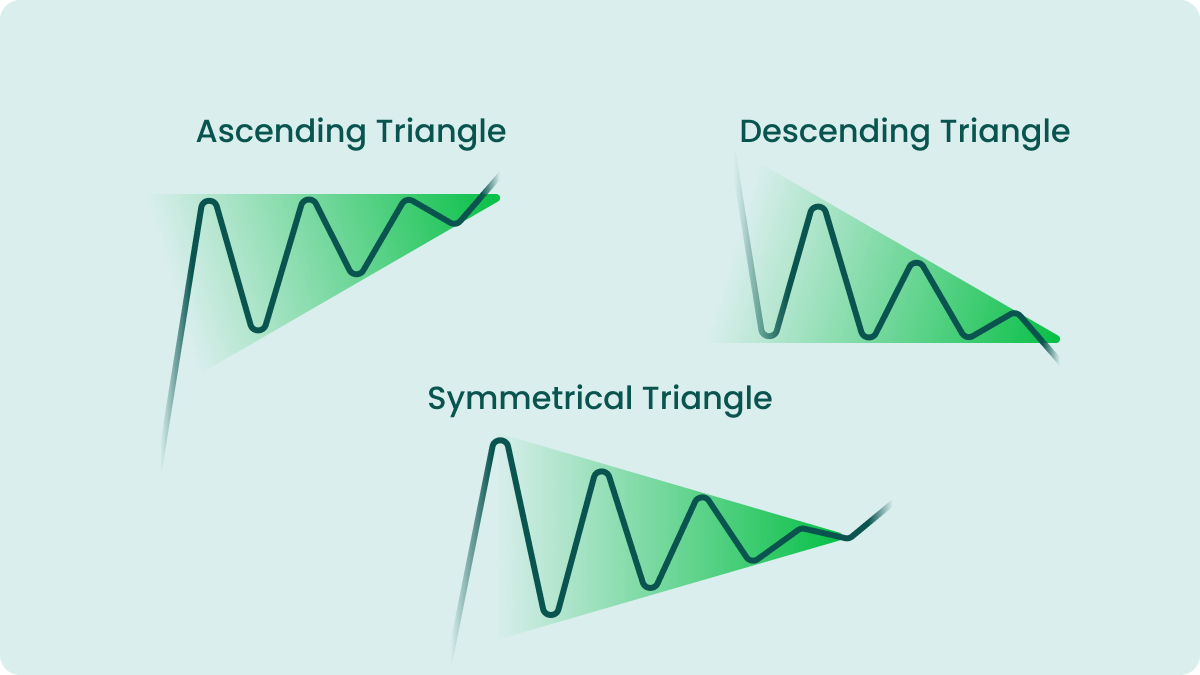
Ascending Triangle
The first chart pattern we’re going to look at is an ascending triangle. This pattern is a bullish continuation pattern that is formed when a price starts to swing within a narrowing range. The upper (resistance) line of an ascending triangle is horizontal, while the lows create the lower (support) line that is climbing towards the resistance line. It maintains its ascent until the price eventually breaks the resistance line, confirming the pattern, and continues the upward movement.
Descending Triangle
A polar opposite of its ascending relative, a descending triangle is a bearish continuation pattern that appears when the price of the stock starts moving between a downward sloping resistance line and a horizontal support line. Once the resistance and support lines merge, a breakout occurs, and the price falls even lower and continues with the downtrend.
Symmetrical Triangle
The last of the triangle chart patterns, a symmetrical triangle is formed by an ascending support line and a descending resistance line. The price bounces from both lines within a continuously narrowing range until the lines cross each other. It is impossible to say where the price will go after the breakout because both buyers and sellers have an equal influence on the market. This is why a symmetrical triangle is considered a bilateral pattern. Traders are advised to place two stop entry orders above and below the lines.
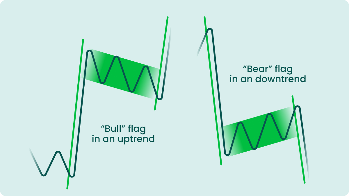
Flag
A flag pattern is often associated with low-risk investments and quick profit. It is a continuation pattern that can occur in the middle of a strong trend. A flag pattern is formed when the trend enters a brief period of consolidation, and it can be both bullish and bearish. After a sudden, almost vertical spike or fall (the so-called ‘flag pole’) the price starts to fluctuate and retraces its previous movement within a narrow range that resembles a slightly tilted rectangle. After a short while the price breaks one of the lines and continues moving in the previous direction while rapidly gaining momentum.
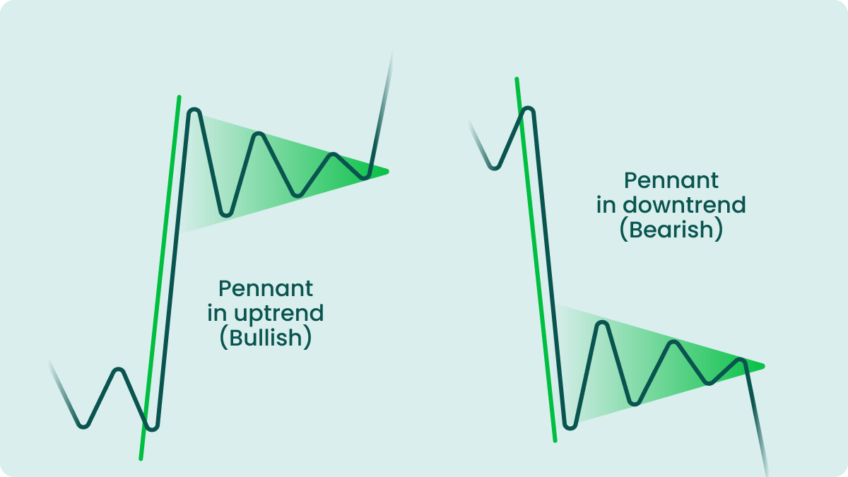
Pennant
A pennant pattern looks very similar to a flag pattern or a symmetrical triangle, being a continuation pattern as well, but it’s quite different from them both. Like a flag pattern, it also occurs when the price enters a consolidation period after a sudden move in one direction (‘flag pole’). However, a pennant’s body is formed by two converging lines, not parallel, which makes it look like a symmetrical triangle. But a triangle pattern is not preceded by a ‘flag pole’ as it manifests in unstable markets. A pennant, on the other hand, occurs within a strong trend. After the lines converge, the price breaks out and most often continues to move in the direction of the main trend.
Double top
A double top is a bearish pattern that occurs before an intermediate or long-term downward reversal. A double top consists of two highs and one low and somewhat resembles the letter “M”. It begins when the price retraces back after a steady increase due to some resistance from the bears. It later picks up again, but when it reaches the level of the previous high, it plunges back down. Once it crosses the neckline, the pattern is considered confirmed, and the trend reverses from bullish to bearish.
Double bottom
A double bottom is the opposite of a double top as it occurs after a downtrend and generally signals the reversal to an uptrend. A double bottom looks like a “W” and is formed when the price rises a bit after a prolonged decline, then goes back down but bounces off the support line and begins to rise, breaking through the neckline. This pattern is often used by traders to identify the best opportunities to start long-term bullish trades.
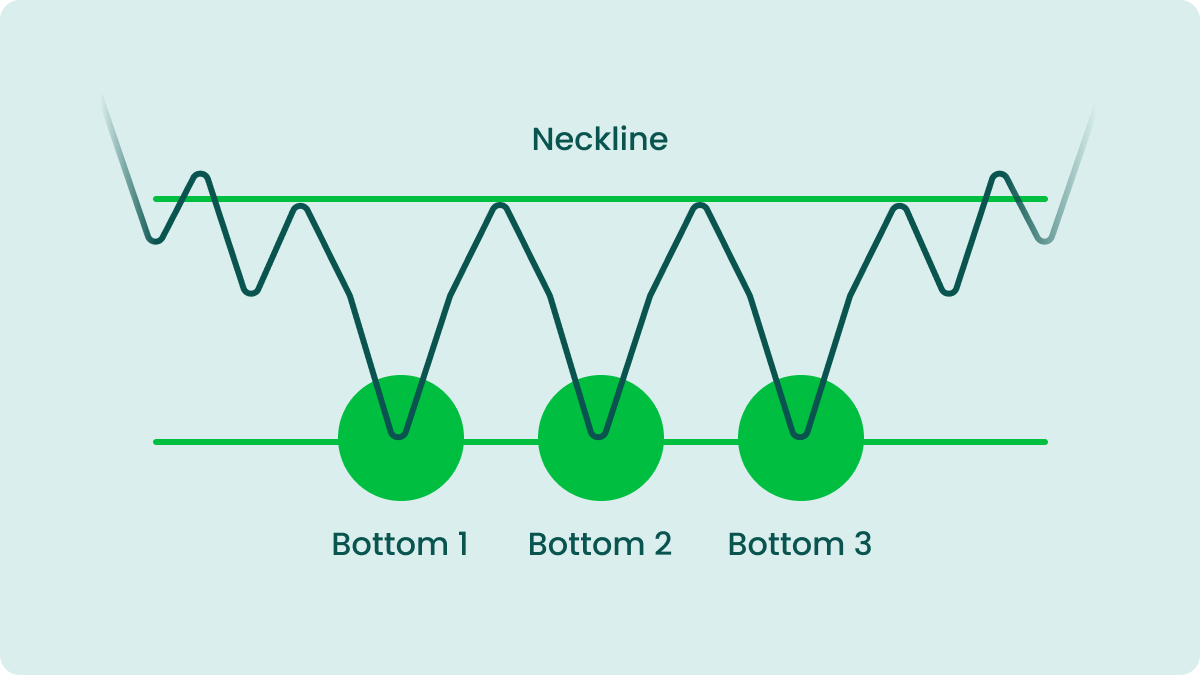
Triple bottom
A triple bottom is a bullish reversal pattern that occurs after an extended period of a downtrend. It consists of three consecutive but spaced out lows, each located on or near the same price level. A triple bottom signals that, despite buyers’ efforts, sellers aren’t willing to give up their positions easily. However, after the third low they usually surrender to the buyers and let the price begin its upward movement after breaking through the neckline. This pattern is one of the rarest, but also one of the strongest and most reliable patterns. So if you manage to identify it on a chart, be sure to make the most of it.
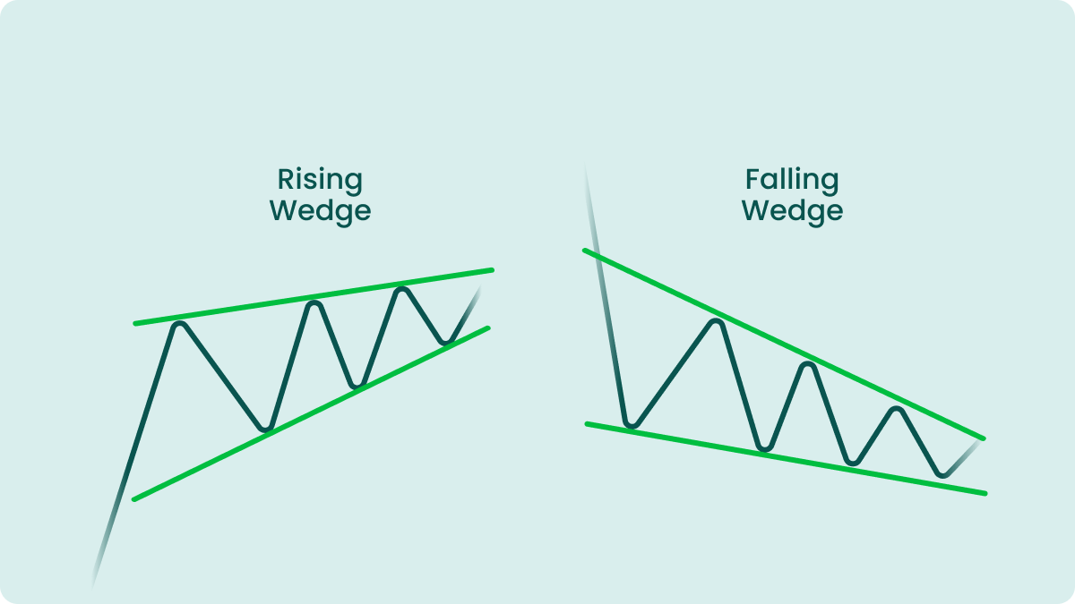
Wedge
A wedge pattern occurs when the price starts moving between two converging trend lines that form a continuously narrowing range. This pattern can be either bullish or bearish, depending on the variation of the pattern itself.
- A falling wedge is considered to be a bullish pattern and it can occur both after a downtrend or an uptrend and serve as a reversal or continuation signal. A falling wedge looks widest at the top and then continues to narrow as the price moves downwards. When the pressure from sellers subsides, buyers get a chance to slow the price decline down, which leads to the price breaking through the resistance line and continuing on with an uptrend.
- A rising wedge is the opposite of a falling wedge. It is generally a bearish pattern that can signal a continuation or reversal of the trend, depending on where the market has been moving before the pattern occurs. It consists of two converging trend lines, and the price is moving upwards within the consolidation period. Buyers eventually get weaker, so sellers manage to break through the support line, marking a new (or continuing with the previous) downtrend.
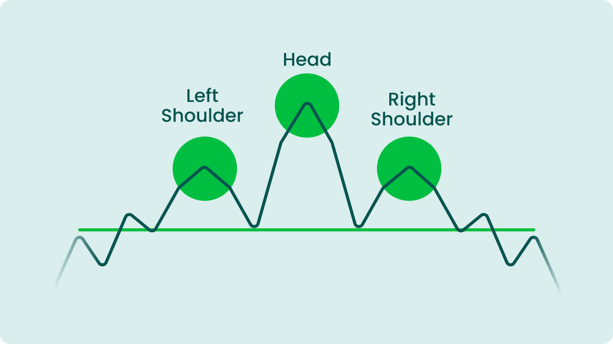
Head and shoulders
A head and shoulders pattern usually occurs at the end of an uptrend and precedes a reversal to a downtrend. It consists of three swings, with the outer two being smaller than the middle one and lying at about the same level. The last swing down tends to break through the neckline (a line that connects the bottoms of the pattern), which gives a signal for traders to sell their stock.
Inverse head and shoulders
This pattern is the opposite of the previous one. It forms within a bearish trend and signals the reversal to an uptrend. An inverse head and shoulders has three troughs, the middle one being the lowest of them all. This pattern is traded similarly to head and shoulders, but it comes before an uptrend, so traders need to buy stocks as soon as the price breaks the neckline.
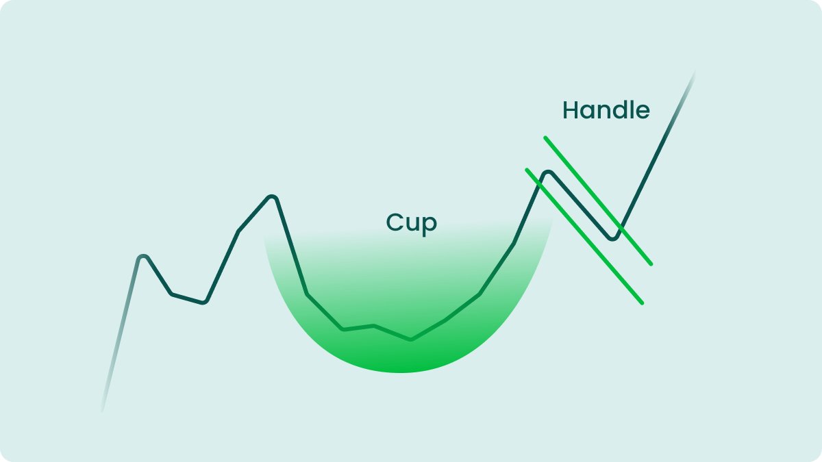
Cup and handle
A cup and handle pattern is a bullish pattern. It generally occurs within an uptrend and is used by traders to find opportunities to go long. This pattern looks like a “U” followed by a slight decline which resembles a cup’s handle. The handle resembles a flag or a pennant pattern, but the price soon breaks through the resistance line and the uptrend quickly gains momentum again.
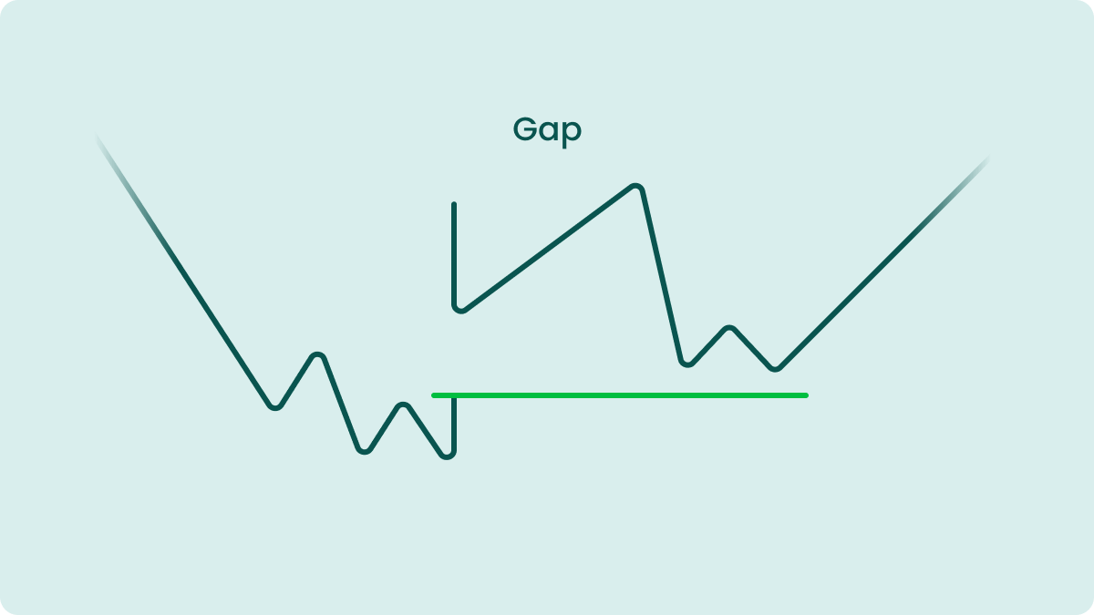
Gaps
Gaps are blank spaces on a chart that occur in volatile markets. They appear when the market is experiencing an extraordinary level of buying or selling interest. This interest leads to the stock being traded even when the market is closed overnight. As a result, the opening price of the stock next day is way different from its closing price from the previous day. Traders tend to capitalize on gaps by buying stocks, hoping for a gap to occur the following day, or by shorting their stocks after the gap has already occurred.
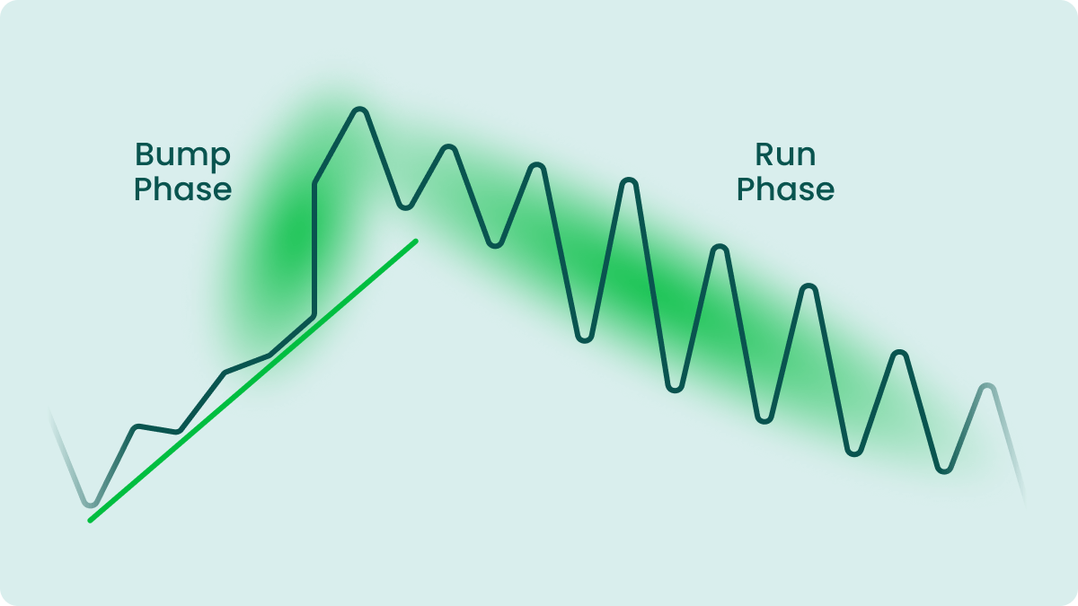
Bump and run
A bump and run is a rare reversal pattern that can occur both in bullish and bearish markets. A bump and run occurs when the price makes a sharp turn from the trend line in the direction of the main trend, then retraces the movement and finally breaks through the previous trend line, which sets off a new trend. This formation is usually visible on larger time frames, but can occasionally appear even on intraday charts.
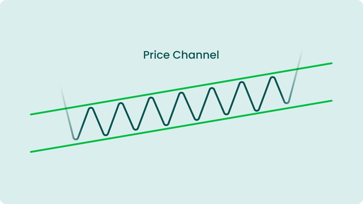
Price channel
A price channel is a bilateral pattern and can occur both within an uptrend and a downtrend. A price channel forms when the price begins to swing within a limited range. The swings bounce off the resistance and support lines, which run parallel to each other. The price may move upwards, downwards, or sideways.
How to recognise chart patterns?
One of the most common ways to identify stock chart patterns is by drawing a trend line and watching whether the price is diverging from its direction. If you see the price oscillating within a limited range, charting lines through the highs and the lows can help you see more clearly if a pattern is forming. It might seem difficult at first, but after practicing you will be able to recognize stock chart patterns better. Your trading platform may also offer various pattern screeners that can help you quickly detect new trading opportunities.
Conclusion
Stock chart patterns have been used by traders for multiple decades. If recognized correctly, they can confirm the beginning of a different trend and help traders identify new trading opportunities. The 15 stock chart patterns listed above will improve your understanding of how the market works and allow you to accurately predict trend reversals and changes in the direction of price movement.