Bill Williams is the creator of some of the most popular market indicators: Awesome Oscillator, Fractals, Alligator, and Gator.

Don’t waste your time – keep track of how NFP affects the US dollar!
Data Collection Notice
We maintain a record of your data to run this website. By clicking the button, you agree to our Privacy Policy.

Beginner Forex Book
Your ultimate guide through the world of trading.
Check Your Inbox!
In our email, you will find the Forex 101 book. Just tap the button to get it!
Risk warning: ᏟᖴᎠs are complex instruments and come with a high risk of losing money rapidly due to leverage.
68.53% of retail investor accounts lose money when trading ᏟᖴᎠs with this provider.
You should consider whether you understand how ᏟᖴᎠs work and whether you can afford to take the high risk of losing your money.
2022-08-26 • Updated
Information is not investment advice
Divergence is frequently used as an indication to predict future price movement. Like any other chart formation, it does not provide a 100% probability of correct predictions. That’s why one needs to be aware of the precise reliability of this tool when making trades based on it. This is what this article is about – it examines the reliability of divergence. We will discover how often divergences occur in the charts and how often prices actually follow the direction predicted by them.
For the price chart, we picked one of the S&P stocks. Primarily, that’s because the stock market appears to behave in a more orderly manner than the currencies in response to global trends. That makes it easier to relate observed price fluctuations to fundamental factors and filter out the noise. Also, we wanted to avoid a one-sided impression from the depressive recent performance among most stocks caused by the virus. That’s why we chose Amazon: it has never been particularly bullish or bearish, and in the meantime, it proved resilient enough to recover its losses and climb to all-time highs recently.
As a counterpart to the chart price, we will use Bill William’s Awesome Oscillator. Although many other oscillators such as MACD, for example, would fit, Awesome Oscillator appears to be more responsive to the price and hence provides more cases of divergence.
In terms of timing, we will look at the most recent price performance – that will be most relevant to the current moment and most useful for a reader.
H1, H4, and Daily timeframes were used in this investigation. That is primarily because these three timeframes give a balanced outlook for short-term, mid-term, and strategic traders. Also, stocks do not favor minute timeframes as they do hourly and daily ones. From an analytical standpoint, fundamental factors reveal themselves on larger timeframes.
Density-to-period is the first axis of evaluation of divergences. It refers to the number of divergence occurrences that appear in 100 periods of the chart. For example, if a 200-period observation depth is taken, and 5 divergences appear during this time, then the density-to-period will be 5/200=2.5%. Alternatively, if a 400-period observation gave 12 divergences, then the density-to-period will be 12/400=3%. That would mean that on every 100 periods there will be 3 divergences on average.
Variety shows how many of each of the four divergence types appear on the screen. Prevalence of one or another type may reflect more bullish or bearish moods driving the price lately.
The number of correct predictions refers to the total number of cases where the price actually went in the direction as per the commonly accepted interpretation scheme. For example, if a regular bearish divergence was found, and after that the price went downwards in a bearish trend, that is counted as one correct prediction. Logically, if after a hidden bullish divergence the price goes sideways or downwards, that cannot be counted as a correct prediction.
The correct divergence-to-aftermath ratio is a part of correct predictions in the total number of cases. For example, if 9 out of 10 divergences present the cases where the price actually goes where it is “supposed” to go as per the divergence, that means that 9 out of 10 predictions were correct. In this scenario, the ratio will be 90%. On the other hand, if 2 out of 10 divergences gave correct prediction, while with the rest the price went either sideways or in the opposite direction, that would make only a 20% correct divergence-to-aftermath ratio.

It appears that the H4 chart was most suited to find divergences although it barely exceeds other timeframes in the density-to-period ratio. Obviously, the numbers of divergences found on each timeframe don’t mean that this is all there is. An attentive examiner would probably find more. However, the very fact that there was approximately 1 divergence for every 100 periods in all timeframes means that this is what an average trader would find in a random chart.
A regular bearish is apparently more common compared to all others, while a hidden bullish never appeared on the screen. That may be a peculiarity of the observed period as heavily impacted by the virus. However, the multitude of bearish divergences should not be solely attributed to bearish price moves prevalent in the price chart.
Another conclusion is that the H4 chart gives a substantially higher probability of correct divergence predictions than H1 and Daily charts. With H4, we have more than 50% of correct predictions (62.5%), while H1 and Daily timeframes give less than 50% (37% and 33% respectively). For practical purposes, it may serve as a confirmation the divergences are more reliable with H4 charts and may be safely used with this particular timeframe
Bearing in mind these findings, let’s have a look at the most recent performance of Amazon stock price.
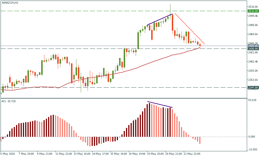
The H1 chart gives a case of a regular bearish divergence marked below, which proved to be correct: the very last episode of the chart shows a downtrend.
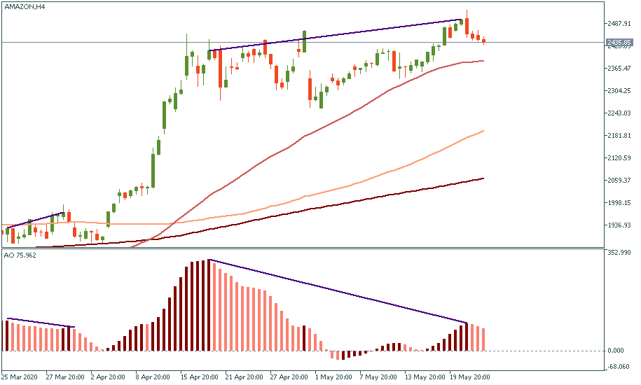
The H4 chart gives us another large regular bearish divergence which just finished formation. Remembering that on the H4 divergence has a 62.5% correctness probability ratio, we have to conclude that we are on the brink of a large downtrend to take place in the nearest mid-term future.
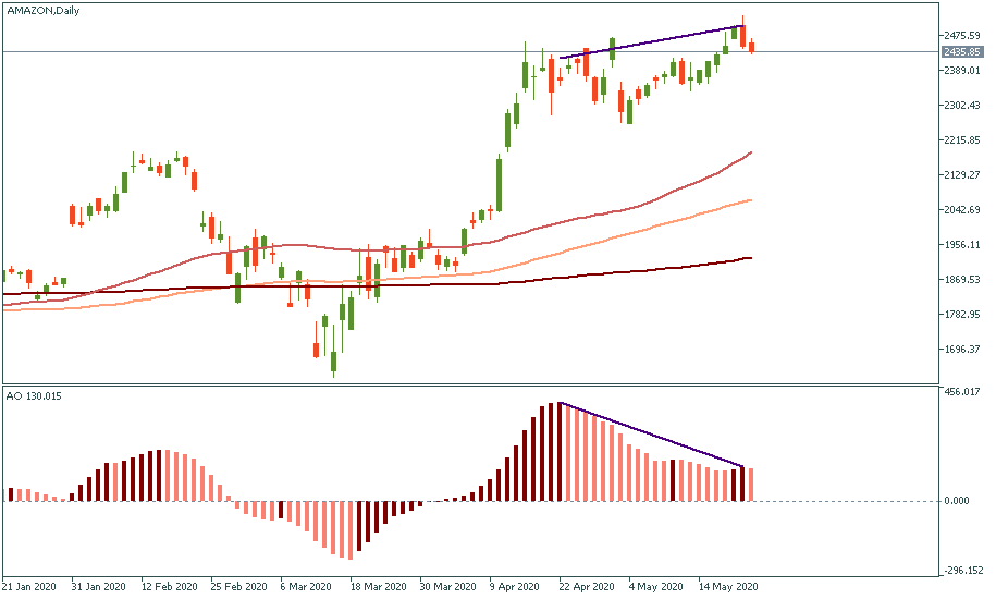
The daily chart reflects the same regular bearish divergence we have observed on the H4 chart.
Divergence, similar to other chart formations and indicators, is used as a technical tool to facilitate the chart reading. In the meantime, it should not be taken alone but rather in the context of the fundamentals. With that in mind, even seeing Amazon stock price beat the virus and victoriously march upwards, we have to be careful with our expectations of this uptrend and carefully watch for the signs of a possible reversal. Apparently, that will be another good test for the divergence indicator to take into account.

Bill Williams is the creator of some of the most popular market indicators: Awesome Oscillator, Fractals, Alligator, and Gator.

Trend strategies are good - they may give significantly good results in any time frame and with any assets. The main idea of the ADX Trend-Based strategy is to try to catch the beginning of the trend.

Counter-trend strategies are always the most dangerous but also the most profitable. We are pleased to present an excellent counter-trend strategy for working in any market and with any assets.
Your request is accepted.
We will call you at the time interval that you chose
Next callback request for this phone number will be available in 00:30:00
If you have an urgent issue please contact us via
Live chat
Internal error. Please try again later